SwiftUI, Apple’s modern UI framework, has made it easier for developers to create beautiful and intuitive interfaces for their iOS, macOS, and other Apple platform apps. One of the many components it offers is the ColorPicker — a simple yet powerful tool that allows users to pick colors. In this tutorial, we’ll walk through the steps to implement a ColorPicker in your SwiftUI application.
Creating a SwiftUI Color Picker
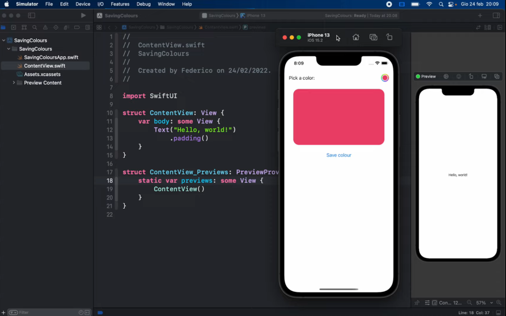
The Color Picker displays the chosen hue, letting users pick a different shade. In this guide, a Rectangle gets colored based on the user’s selection from the color picker. This guide is tailored for iOS14 and Xcode 12, available for download on the Apple developer portal.
- Launch Xcode. You can either opt for ‘Create a new Xcode project’ from the startup screen or go to File > New > Project;
- When prompted to choose a template, ensure the platform is set to iOS, pick the App template from the Application category, and proceed by clicking ‘Next’;
- Name your project ‘SwiftUIColorPickerTutorial’;
- For interface, choose ‘SwiftUI’, select ‘SwiftUI App’ for the Life Cycle, and ‘Swift’ as the programming language;
- Uncheck the ‘Include Tests’ option and proceed by clicking ‘Next’;
- Decide where you’d like to save this project on your Mac.
If you wish to view a preview, click on ‘Resume’ in the canvas. If you can’t see the canvas, navigate to Editor > Editor and Canvas to make it visible.
In the Project navigator, click on ContentView.swift to select it, and then proceed to modify the code within the ContentView struct as follows:
struct ContentView: View {
    // 1.
    @State private var selectedColor = Color.red

    var body: some View {

        NavigationView {
            VStack(spacing: 20) {
                // 2.
                Rectangle()
                    .fill(selectedColor)
                    .frame(width: 100, height: 100)
                // 3.
                ColorPicker("Set the rectangle color", selection: $selectedColor)
                    .padding()

                Spacer()

            }.navigationTitle("Color picker")
        }
    }
}- A State property is set up to store the color chosen from the color picker, with a default hue of red that will be displayed when the application launches.
- A rectangle is presented, its fill color reflecting the current hue chosen from the color picker;
- The color picker pops up once the circular colored icon is clicked;
- Navigate to the Preview and activate the Live Preview feature. Click on the circular icon to access the color picker;
- Pick a hue either from the preset colors or adjust the sliders, and then close the color picker. The rectangle’s fill will adapt to the chosen hue.
You can find the source code for SwiftUIColorPickerTutorial at the ioscreator’s GitHub repository.
Testing the Implementation
To see your ColorPicker in action:
- Open the canvas by clicking on ‘Resume’;
- Activate Live Preview;
- Interact with the ColorPicker by clicking on it, choose a color, and watch the rectangle’s fill color change accordingly.
Conclusion
Integrating SwiftUI’s ColorPicker not only enriches the visual aspect of your app but also promotes user engagement. This tutorial has provided a comprehensive guide to incorporating this tool, ensuring you can confidently empower users to personalize their experience. As you delve deeper into SwiftUI’s offerings, you’ll discover even more ways to revolutionize and refine your application’s interface. Keep exploring and happy coding!
If you found our tutorial on integrating SwiftUI’s ColorPicker valuable, you may also like our tutorial on creating effective PopOver displays. Dive into this guide to further enhance your app’s user interface and experience.